When we think about a brand we consider everything from the logo, the website, social media experiences, the product that they offer as well as the customer experience. In short, your brand is the way your customer perceives you.
Having a good eye-catching logo is very important to the branding of the company’s name. People are drawn to interesting design and color.
A professional logo design should draw interest and pick the curiosity of your potential customers prompting them to at least look, and hopefully purchase your product.
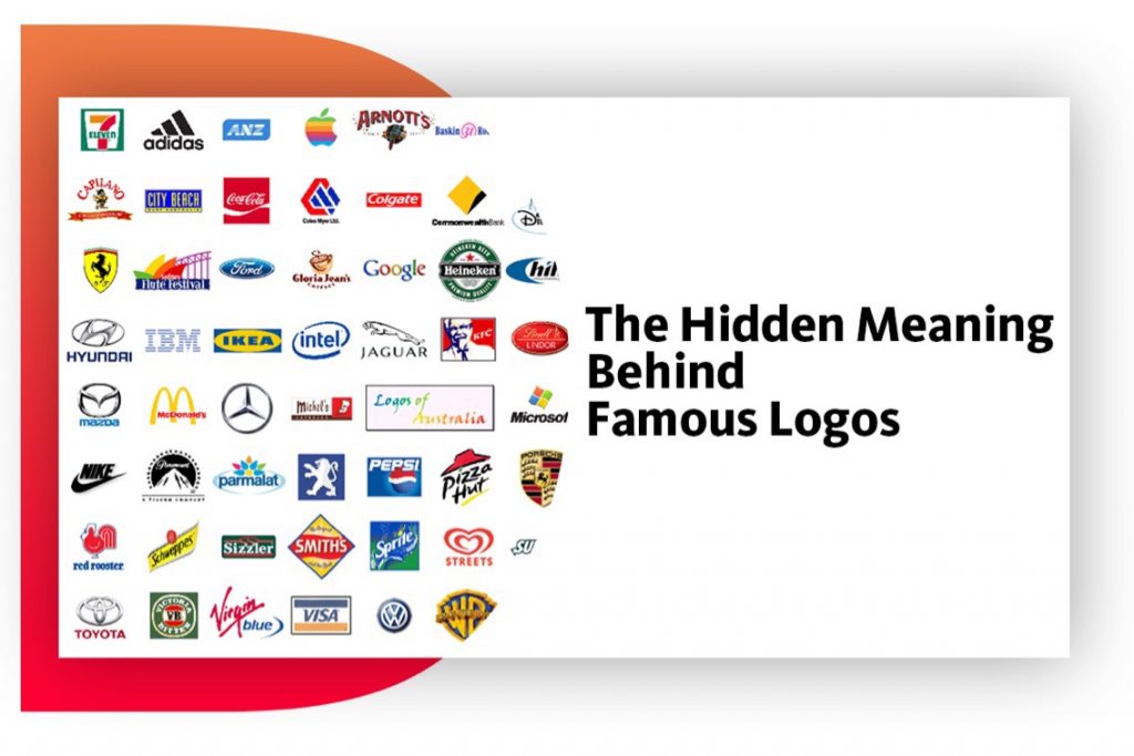
Famous brands have amazing logos that don’t even have the brand name integrated into their design yet most people could recognize them by just looking at the logo.
In a logo, every line, curve and color has meaning behind it. Many of them have been designed to indicate something much more than simple beauty.
The logo of the company HYUNDAI signifies not just the letter ‘H’ but symbolises two people, a client and a representative of the company shaking hands.
The logo of the company ADIDAS has changed many times over the years but always includes three stripes. The current logo signifies a mountain which in turn represents the challenges faced by all sportsmen.
The orange color arrow in the logo of AMAZON shows a smile which shows that the company wants all its customers to be satisfied. Also, the arrow extends from ‘A’ to ‘Z’ showing that they sell absolutely everything.
EVERNOTE uses the animal elephant in their logo because they have impressive memories.
Having a good logo is about more than just making a good first impression. It represents a company – it defines its identity – its purpose and is an integral part of the company’s brand strategy.
Howdy! This is my first visit to your blog!
We are a group of volunteers and starting a new project in a community in the same niche.
Your blog provided us valuable information to work on. You have done a marvellous job!
Wow, I had no idea about the hidden meanings behind some of these famous logos! The Nike swoosh symbolizing the wing of the Greek goddess Nike was really interesting. It’s amazing how much thought and symbolism goes into these logos. Great post!
What’s up everyone, it’s my first pay a quick visit at this website, and piece
of writing is in fact fruitful designed for me, keep up posting these articles.
I loved this post! I had no idea that the Nike swoosh was inspired by the wing of the Greek goddess Victory. So cool! It’s amazing how logos can hold such deep meanings behind their simple designs.
I loved this post! I had no idea that the Target logo was meant to represent the bullseye. It makes so much sense now. And I’m definitely looking at logos differently from now on. Thanks for sharing your insight!
Good day very cool website!! Man .. Beautiful .. Amazing ..
I’ll bookmark your blog and take the feeds also?
I am glad to find a lot of helpful info here in the publish, we’d like develop extra strategies on this regard,
thank you for sharing. . . . . .
I was recommended this blog by my cousin. I’m not sure whether this post is written by him as no one else know such detailed about my problem. You’re amazing! Thanks!
Thanks for one’s marvelous posting! I quite enjoyed reading it, you are a great author.
I will be sure to bookmark your blog and will often come back sometime soon. I
want to encourage that you continue your great work, have a nice evening!
Greetings I am so happy I found your blog page, I really found you by accident, while I was
looking on Aol for something else, Nonetheless I am here now and would just like to say thank you for
a incredible post and a all round thrilling blog
(I also love the theme/design), I don’t have time to read through it all at the minute but
I have bookmarked it and also added in your RSS feeds,
so when I have time I will be back to read a great deal more, Please do keep up
the fantastic work.
This web site is really a walk-through for all of the info you wanted about this and didn’t know who to ask. Glimpse here, and you’ll definitely discover it.
Hello there, simply changed into alert to your blog thru Google, and located that it’s truly informative. I’m gonna be careful for brussels. I will appreciate in case you continue this in future. Many folks can be benefited from your writing. Cheers!
Aw, this was an incredibly nice post. Taking a few minutes and actual
effort to generate a great article… but what can I say… I hesitate a lot and
don’t manage to get anything done.
I am really enjoying the theme/design of your web site. Do you ever run into any
browser compatibility issues? A few of my blog visitors have complained about my
website not working correctly in Explorer but looks great in Opera.
I cling on to listening to the reports speak about receiving free online grant applications so I have been looking around for the most excellent site to get one. Could you tell me please, where could i get some?
Hi, I think your site might be having browser compatibility issues. When I look at your website in Safari, it looks fine but when opening in Internet Explorer, it has some overlapping. I just wanted to give you a quick heads up! Other then that, fantastic blog!
Hello my loved one! I want to say that this article is amazing,
nice written and come with almost all significant infos.
I’d like to look more posts like this .
This is very interesting, You’re a very skilled blogger. I’ve joined your feed and look forward to seeking more of your great post. Also, I’ve shared your site in my social networks!
It’s in point of fact a nice and helpful piece of info. I am satisfied that you just shared this helpful information with us. Please stay us informed like this. Thank you for sharing.
Thank you, I’ve recently been searching for information approximately this topic for ages and yours is the greatest I’ve discovered so far. But, what about the bottom line? Are you certain concerning the source?
Magnificent website. Plenty of helpful info here. I’m sending it to a few buddies ans additionally sharing in delicious. And certainly, thanks for your sweat!
Loved this post! It’s fascinating to dive into the stories and meanings behind these iconic logos. The connections you made really changed the way I see them now. Can’t wait to read more on this topic!
My brother recommended I might like this website. He was entirely right. This post truly made my day. You can not imagine simply how much time I had spent for this information! Thanks!
I like the valuable info you provide in your articles. I will bookmark your weblog and check again here regularly. I’m quite sure I will learn a lot of new stuff right here! Best of luck for the next!
I simply had to say thanks yet again. I’m not certain the things I would have worked on without the entire aspects documented by you directly on such a field. This has been a real traumatic difficulty in my opinion, however , encountering the specialised way you solved it made me to cry over joy. Extremely grateful for your guidance and even have high hopes you recognize what an amazing job you happen to be doing teaching the others thru your webblog. I am sure you haven’t got to know all of us.
Hey There. I discovered your blog the usage of msn. This is an extremely well written article. I’ll make sure to bookmark it and come back to learn extra of your helpful info. Thanks for the post. I’ll certainly comeback.
An impressive share, I just given this onto a colleague who was doing a little analysis on this. And he in fact bought me breakfast because I found it for him.. smile. So let me reword that: Thnx for the treat! But yeah Thnkx for spending the time to discuss this, I feel strongly about it and love reading more on this topic. If possible, as you become expertise, would you mind updating your blog with more details? It is highly helpful for me. Big thumb up for this blog post!
whoah this blog is excellent i love reading your posts. Keep up the great work! You know, many people are hunting around for this information, you could help them greatly.
I take pleasure in, result in I discovered exactly what I used
to be looking for. You’ve ended my 4 day long hunt!
God Bless you man. Have a nice day. Bye
Hiya! I know this is kinda off topic nevertheless I’d figured I’d ask.
Would you be interested in trading links or maybe guest writing a blog post or vice-versa?
My blog addresses a lot of the same subjects as yours and I feel
we could greatly benefit from each other. If you happen to be interested
feel free to shoot me an e-mail. I look forward to hearing from you!
Fantastic blog by the way!
With havin so much written content do you ever run into any problems of plagorism or copyright
infringement? My site has a lot of completely unique content I’ve either
authored myself or outsourced but it seems a lot of it is popping it up all over the web without my authorization. Do you know any
ways to help prevent content from being stolen? I’d certainly appreciate it.
whoah this blog is excellent i like reading your articles.
Keep up the great work! You realize, many individuals are searching around
for this information, you could help them greatly.
Hello there! This post couldn’t be written any better! Reading
through this post reminds me of my good old room
mate! He always kept talking about this. I will forward
this post to him. Pretty sure he will have a good read. Thanks for sharing!
I’ve been browsing on-line greater than 3 hours as of late, yet I by no means found
any fascinating article like yours. It is lovely price enough for
me. In my opinion, if all website owners and bloggers made just right
content material as you probably did, the web will probably be much
more helpful than ever before.
I would like to thank you for the efforts you have put in writing this site.
I’m hoping to check out the same high-grade blog posts by you later
on as well. In truth, your creative writing abilities has motivated
me to get my very own blog now 😉
Pretty nice post. I just stumbled upon your blog and wanted to say that I have really loved surfing around your weblog posts.
In any case I will be subscribing on your feed and I hope you write once more very soon!
I am curious to find out what blog platform you have been utilizing?
I’m experiencing some small security issues with my latest website and I would like to find something more safeguarded.
Do you have any suggestions?
I must thank you for the efforts you’ve put in penning this website.
I really hope to see the same high-grade content from you
in the future as well. In truth, your creative writing abilities has motivated me to get my own site now
😉
My brother recommended I would possibly like this blog. He used to be totally right.
This put up actually made my day. You cann’t consider simply how much time
I had spent for this information! Thank you!
I’m impressed, I must say. Seldom do I come across a blog that’s
both educative and interesting, and without a doubt,
you have hit the nail on the head. The problem is something which not enough
people are speaking intelligently about. Now i’m
very happy that I stumbled across this during my hunt for something relating to this.
I’m not that much of a internet reader to be honest but your sites really nice, keep it up!
I’ll go ahead and bookmark your site to come back down the road.
Thank you, I’ve recently been searching for info about this topic for a while and yours is the greatest I’ve came upon so far.
But, what in regards to the conclusion? Are you certain about the supply?
I am extremely impressed with your writing skills as well as with the
layout on your blog. Is this a paid theme or did you
modify it yourself? Either way keep up the excellent quality writing, it is rare to see
a nice blog like this one nowadays.
Its like you read my mind! You seem to know so much about
this, like you wrote the book in it or something. I think that you could do with a
few pics to drive the message home a bit, but instead of that,
this is great blog. A fantastic read. I’ll definitely be back.
This post was incredibly insightful! I never realized the depth of meaning behind some of the logos we see every day. The explanation of the FedEx logo really blew my mind—it’s amazing how they cleverly incorporated an arrow to represent speed and precision. I’m definitely going to look at logos differently now! Thank you for sharing these fascinating details!
Very amazing post. Logo designing is really an art of representing the brand image in the form of few shapes and colors.
I want to to thank you for this great read!! I certainly loved
every bit of it. I have got you book marked to look at new stuff you post…
Howdy! This is my first visit to your blog!
We are a group of volunteers and starting a new project in a community in the same niche.
Your blog provided us valuable information to work on. You have done a marvellous job!
I love this post! It’s so interesting to learn about the hidden meanings behind famous logos.
Useful information. Lucky me I discovered your website accidentally, and I am surprised why this accident didn’t took place earlier!
I bookmarked it.
Wow, I had no idea about the hidden meanings behind some of these famous logos! The Nike swoosh symbolizing the wing of the Greek goddess Nike was really interesting. It’s amazing how much thought and symbolism goes into these logos. Great post!
Hi, I would like to subscribe for this website to get most up-to-date updates, so
where can i do it please help out.
What’s up everyone, it’s my first pay a quick visit at this website, and piece
of writing is in fact fruitful designed for me, keep up posting these articles.
I loved this post! I had no idea that the Nike swoosh was inspired by the wing of the Greek goddess Victory. So cool! It’s amazing how logos can hold such deep meanings behind their simple designs.
I loved this post! I had no idea that the Target logo was meant to represent the bullseye. It makes so much sense now. And I’m definitely looking at logos differently from now on. Thanks for sharing your insight!
I could not refrain from commenting. Very well written!
Good day very cool website!! Man .. Beautiful .. Amazing ..
I’ll bookmark your blog and take the feeds also?
I am glad to find a lot of helpful info here in the publish, we’d like develop extra strategies on this regard,
thank you for sharing. . . . . .
I was recommended this blog by my cousin. I’m not sure whether this post is written by him as no one else know such detailed about my problem. You’re amazing! Thanks!
Thanks for one’s marvelous posting! I quite enjoyed reading it, you are a great author.
I will be sure to bookmark your blog and will often come back sometime soon. I
want to encourage that you continue your great work, have a nice evening!
Greetings I am so happy I found your blog page, I really found you by accident, while I was
looking on Aol for something else, Nonetheless I am here now and would just like to say thank you for
a incredible post and a all round thrilling blog
(I also love the theme/design), I don’t have time to read through it all at the minute but
I have bookmarked it and also added in your RSS feeds,
so when I have time I will be back to read a great deal more, Please do keep up
the fantastic work.
It’s hard to find knowledgeable people on this topic, but you seem
like you know what you’re talking about! Thanks
What’s Happening i’m new to this, I stumbled upon this I
have found It absolutely helpful and it has helped me out loads.
I am hoping to give a contribution & assist other users like its helped
me. Great job.
Wow, this article is good, my younger sister is analyzing such things, therefore I am going to let know
her.
Very good article. I certainly appreciate this website.
Keep writing!
This web site is really a walk-through for all of the info you wanted about this and didn’t know who to ask. Glimpse here, and you’ll definitely discover it.
Hello there, simply changed into alert to your blog thru Google, and located that it’s truly informative. I’m gonna be careful for brussels. I will appreciate in case you continue this in future. Many folks can be benefited from your writing. Cheers!
I as well conceive hence, perfectly composed post! .
I always spent my half an hour to read this website’s posts everyday along with a cup of coffee.
Aw, this was an incredibly nice post. Taking a few minutes and actual
effort to generate a great article… but what can I say… I hesitate a lot and
don’t manage to get anything done.
What’s up, I check your new stuff on a regular basis.
Your humoristic style is awesome, keep it up!
Appreciate the recommendation. Let me try it out.
I am really enjoying the theme/design of your web site. Do you ever run into any
browser compatibility issues? A few of my blog visitors have complained about my
website not working correctly in Explorer but looks great in Opera.
Do you have any advice to help fix this issue?
I am not really excellent with English but I get hold this very leisurely to translate.
F*ckin’ awesome issues here. I am very happy to peer your article. Thanks a lot and i’m looking ahead to touch you. Will you kindly drop me a mail?
I cling on to listening to the reports speak about receiving free online grant applications so I have been looking around for the most excellent site to get one. Could you tell me please, where could i get some?
Greetings! Very helpful advice on this article! It is the little changes that make the biggest changes. Thanks a lot for sharing!
Woh I enjoy your posts, bookmarked! .
Keep working ,great job!
Dead pent articles, Really enjoyed examining.
Wohh precisely what I was looking for, thankyou for putting up.
Hi, I think your site might be having browser compatibility issues. When I look at your website in Safari, it looks fine but when opening in Internet Explorer, it has some overlapping. I just wanted to give you a quick heads up! Other then that, fantastic blog!
You have noted very interesting details ! ps nice web site.
Very interesting details you have observed, appreciate it for posting.
Hello my loved one! I want to say that this article is amazing,
nice written and come with almost all significant infos.
I’d like to look more posts like this .
This is very interesting, You’re a very skilled blogger. I’ve joined your feed and look forward to seeking more of your great post. Also, I’ve shared your site in my social networks!
It’s in point of fact a nice and helpful piece of info. I am satisfied that you just shared this helpful information with us. Please stay us informed like this. Thank you for sharing.
Thank you, I’ve recently been searching for information approximately this topic for ages and yours is the greatest I’ve discovered so far. But, what about the bottom line? Are you certain concerning the source?
Magnificent website. Plenty of helpful info here. I’m sending it to a few buddies ans additionally sharing in delicious. And certainly, thanks for your sweat!
Pretty! This was a really wonderful post. Thank you for your provided information.
Fantastic site. A lot of useful information here. I’m sending it to some friends ans also sharing in delicious. And naturally, thanks for your sweat!
Loved this post! It’s fascinating to dive into the stories and meanings behind these iconic logos. The connections you made really changed the way I see them now. Can’t wait to read more on this topic!
My brother recommended I might like this website. He was entirely right. This post truly made my day. You can not imagine simply how much time I had spent for this information! Thanks!
I like the valuable info you provide in your articles. I will bookmark your weblog and check again here regularly. I’m quite sure I will learn a lot of new stuff right here! Best of luck for the next!
I simply had to say thanks yet again. I’m not certain the things I would have worked on without the entire aspects documented by you directly on such a field. This has been a real traumatic difficulty in my opinion, however , encountering the specialised way you solved it made me to cry over joy. Extremely grateful for your guidance and even have high hopes you recognize what an amazing job you happen to be doing teaching the others thru your webblog. I am sure you haven’t got to know all of us.
Hey There. I discovered your blog the usage of msn. This is an extremely well written article. I’ll make sure to bookmark it and come back to learn extra of your helpful info. Thanks for the post. I’ll certainly comeback.
An impressive share, I just given this onto a colleague who was doing a little analysis on this. And he in fact bought me breakfast because I found it for him.. smile. So let me reword that: Thnx for the treat! But yeah Thnkx for spending the time to discuss this, I feel strongly about it and love reading more on this topic. If possible, as you become expertise, would you mind updating your blog with more details? It is highly helpful for me. Big thumb up for this blog post!
whoah this blog is excellent i love reading your posts. Keep up the great work! You know, many people are hunting around for this information, you could help them greatly.
I take pleasure in, result in I discovered exactly what I used
to be looking for. You’ve ended my 4 day long hunt!
God Bless you man. Have a nice day. Bye
Thanks for posting this. It’s very helpful!
It’s onerous to search out educated folks on this topic, however you sound like you realize what you’re speaking about! Thanks
Hiya! I know this is kinda off topic nevertheless I’d figured I’d ask.
Would you be interested in trading links or maybe guest writing a blog post or vice-versa?
My blog addresses a lot of the same subjects as yours and I feel
we could greatly benefit from each other. If you happen to be interested
feel free to shoot me an e-mail. I look forward to hearing from you!
Fantastic blog by the way!
With havin so much written content do you ever run into any problems of plagorism or copyright
infringement? My site has a lot of completely unique content I’ve either
authored myself or outsourced but it seems a lot of it is popping it up all over the web without my authorization. Do you know any
ways to help prevent content from being stolen? I’d certainly appreciate it.
Hi, after reading this amazing article i am also cheerful
to share my knowledge here with colleagues.
whoah this blog is excellent i like reading your articles.
Keep up the great work! You realize, many individuals are searching around
for this information, you could help them greatly.
Hello there! This post couldn’t be written any better! Reading
through this post reminds me of my good old room
mate! He always kept talking about this. I will forward
this post to him. Pretty sure he will have a good read. Thanks for sharing!
For newest news you have to pay a visit the web and on the web
I found this site as a best web site for newest updates.
I’ve been browsing on-line greater than 3 hours as of late, yet I by no means found
any fascinating article like yours. It is lovely price enough for
me. In my opinion, if all website owners and bloggers made just right
content material as you probably did, the web will probably be much
more helpful than ever before.
I would like to thank you for the efforts you have put in writing this site.
I’m hoping to check out the same high-grade blog posts by you later
on as well. In truth, your creative writing abilities has motivated
me to get my very own blog now 😉
Pretty nice post. I just stumbled upon your blog and wanted to say that I have really loved surfing around your weblog posts.
In any case I will be subscribing on your feed and I hope you write once more very soon!
I am curious to find out what blog platform you have been utilizing?
I’m experiencing some small security issues with my latest website and I would like to find something more safeguarded.
Do you have any suggestions?
I must thank you for the efforts you’ve put in penning this website.
I really hope to see the same high-grade content from you
in the future as well. In truth, your creative writing abilities has motivated me to get my own site now
😉
My brother recommended I would possibly like this blog. He used to be totally right.
This put up actually made my day. You cann’t consider simply how much time
I had spent for this information! Thank you!
I all the time used to study paragraph in news papers but now as I am a
user of web thus from now I am using net for articles, thanks
to web.
I’m impressed, I must say. Seldom do I come across a blog that’s
both educative and interesting, and without a doubt,
you have hit the nail on the head. The problem is something which not enough
people are speaking intelligently about. Now i’m
very happy that I stumbled across this during my hunt for something relating to this.
Appreciate this post. Will try it out.
Very rapidly this web page will be famous among all blogging and
site-building users, due to it’s nice content
I’m not that much of a internet reader to be honest but your sites really nice, keep it up!
I’ll go ahead and bookmark your site to come back down the road.
All the best
Thank you, I’ve recently been searching for info about this topic for a while and yours is the greatest I’ve came upon so far.
But, what in regards to the conclusion? Are you certain about the supply?
I am extremely impressed with your writing skills as well as with the
layout on your blog. Is this a paid theme or did you
modify it yourself? Either way keep up the excellent quality writing, it is rare to see
a nice blog like this one nowadays.
I every time spent my half an hour to read this weblog’s articles or
reviews daily along with a mug of coffee.
Good article! We are linking to this great content on our site.
Keep up the good writing.
Its like you read my mind! You seem to know so much about
this, like you wrote the book in it or something. I think that you could do with a
few pics to drive the message home a bit, but instead of that,
this is great blog. A fantastic read. I’ll definitely be back.
A great post without any doubt.
Great write-up, I am regular visitor of one?¦s blog, maintain up the nice operate, and It is going to be a regular visitor for a lengthy time.
This post was incredibly insightful! I never realized the depth of meaning behind some of the logos we see every day. The explanation of the FedEx logo really blew my mind—it’s amazing how they cleverly incorporated an arrow to represent speed and precision. I’m definitely going to look at logos differently now! Thank you for sharing these fascinating details!